One of the most exclusive features and objectives of Amazon is that it doesn’t want to seem like one large company with thousands of pages of product that consumers must navigate. Instead, it wants to create a way for small businesses to present their products on the site so that customers can interact with them. It’s done through storefronts, each one allowing your small business to display products to Amazon’s customers.
Increasing your conversion rate even slightly on your platform can have major impacts on the growth of your business. The best way to increase your conversion rate is through your online storefront because it is the most direct link between you and your customer.
When a consumer comes to your product listing in Amazon, they’ll do one of two things: purchase or leave. You want your listing to attract more purchasers and deter the leavers. This means you need to design your storefront in a way that encourages customers to make a purchase.
What is an Amazon storefront?
An Amazon Store, also called an Amazon storefront, provides sellers on Amazon with a dedicated website for selling their products. With an Amazon Store, shoppers can explore and purchase a brand’s products while sellers can create a browsing experience that revolves around their brand and products.
The following components make up an Amazon Storefront:
- Pages – the store’s webpages, which also define the navigation menu
- Templates – predefined layouts to help create your pages
- Header – a large “hero image”, brand logo, and navigation bar at the top of each page
- Sections – the main horizontal areas or “rows” of a page, which tiles are added into
- Tiles – content widgets used in pages including text, images, videos, and products.
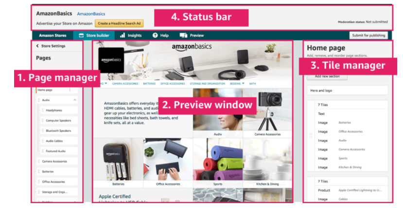
Source: Webretailer
Amazon Storefront Optimization Techniques
For Amazon storefront optimization, here are some successful ways for you to better connect with your customers and increase sales.
Use quality images
Since the imagery you use is equivalent to the products on the shelves, ensure its quality. With all images uploaded to Amazon listings expected to be at least 1000 pixels by 1000 pixels, your visuals should have pure, white backgrounds with the products taking up to 85% of the frame. This puts the emphasis on the product without any clutter or confusion.
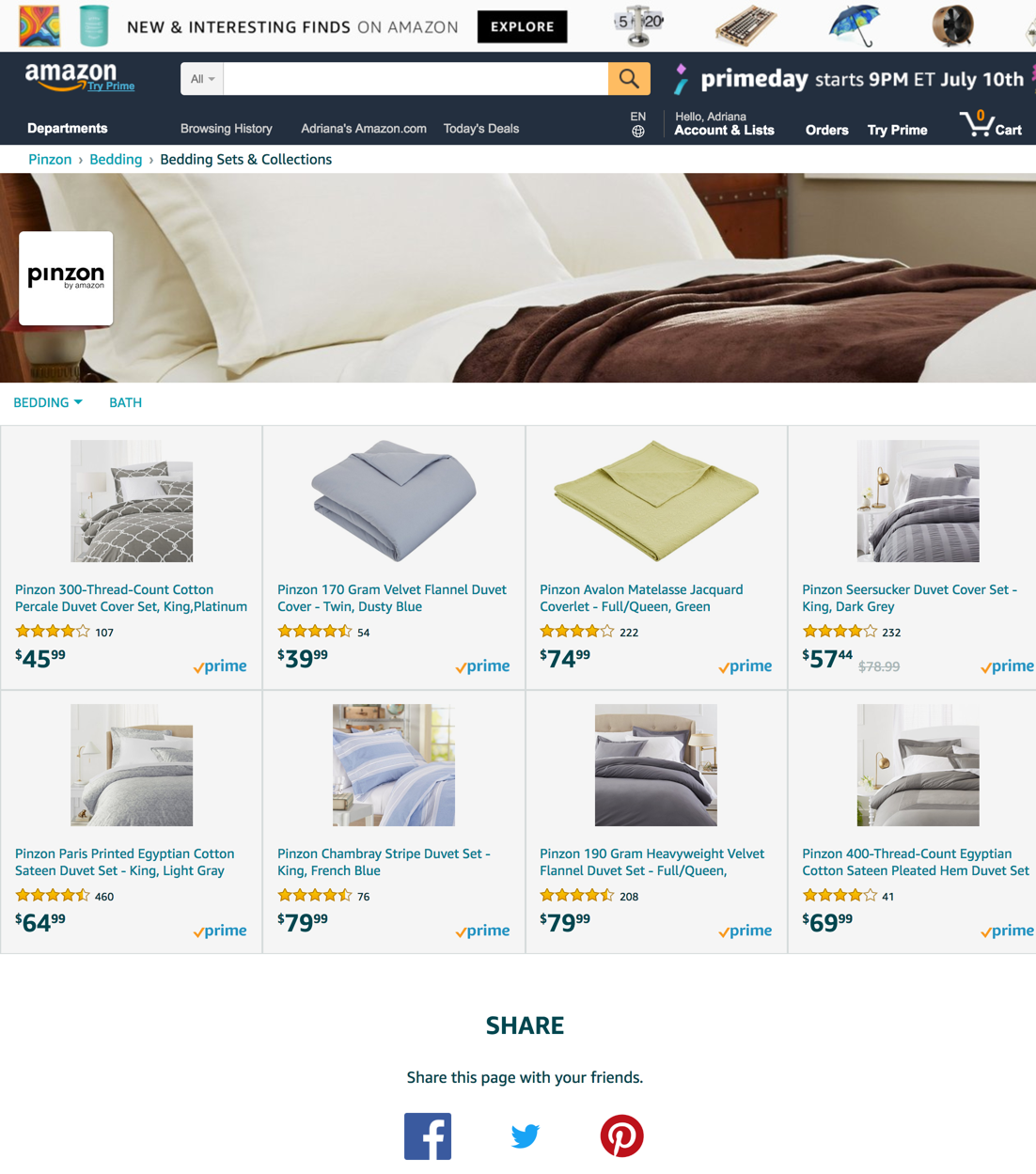
Source: Amazon
Also, videos (that are either click-to-play or autoplay) are a fantastic tool for selling your product; however, they should be less than 20 seconds long and loop or repeat – without audio.
- Cater to the type of customer you want: Design your page to attract a very specific target customer. It helps lead customers through an optimized experience while showing off the entire product range. Ensure to tailor your storefront’s design around the customer’s pain points.
- Keep it simple: Keep design to a minimum and the user experience (UX) as direct and engaging as possible because putting too much in front of your customer can sometimes overwhelm them enough to move away. Especially for businesses with a large inventory, a simplistic and clearly designed page is the way to go.
- Use target keywords: Amazon uses keywords to rank your products in the right search results. It’s important that you choose appropriate keywords for your listings. You want your products to appear in search results that are relevant.
- Answer questions: Amazon offers a Q&A section, where customers can ask questions about your product. This is an opportunity to show your customer service, go in-depth about your product, and even show off more of your brand voice.
It is important you keep track of those questions that are being asked frequently. This means it’s a primary concern for customers that you’ll want to address in the main body of your listing.
Use enhancement tools
To use your customization option, tools like Enhanced Brand Content (EBC) are very useful for professional sellers on Amazon who have been approved as Brand Registry Owners.
This tool allows you to customize your Amazon storefront with modified description fields, superior images, and text placement templates. Basically, you can make your Amazon storefront look more like a branded website than a typical Amazon listing.
- Include your Amazon storefront on other platforms: You can show your Amazon listing through social media platforms. For example, Shopify offers a plugin that allows you to link your Amazon sales channel to your Shopify website. This integration of both storefronts creates an omnichannel experience for your customers, which enhances the cohesiveness and credibility of your brand.
- Set the right price: Amazon uses your pricing to predict how your products will perform; therefore it is important you research your competition to see how your prices compare to theirs. If you have room to adjust your price, it is beneficial, because if your products are priced higher than the other selection of products, users are more likely to choose the cheaper option – especially if the star rating is the same. However, you can also improve your listings by choosing different keywords to appear in better results.
- Maintain the rules of sales: Remember that your Amazon listing is your foundational piece of marketing. It’s more than just a description of your product. It is the number one tool that can sell your product. Therefore, apply the basic rules of selling to your Amazon listing, which includes urgency and exclusivity.
Best Practices to Optimize Your Amazon Storefront
- Abide by Amazon’s Rules
While optimizing your Amazon Storefront, make sure any changes you make abide by Amazon Terms of Service:
Clear CTAs: Feature a CTA properly, which means they must be clear and direct instead of “click here” types of messages.
Proofreading: Capitalization is important, too. Be sure to write in sentence case for all titles and descriptions and follow generally good grammar here.
Truthful Statements: When using any type of claim or comparative statements, be truthful and verifiable.
Warranties and Guarantees: Be very specific about warranties and guarantees.
Image Sizes: There are four basic types of images to choose from with their resolution and aspect ratio, rightly used.
- Logo image (banner at the top): 3,000 x 600 pixels
- Full Width images: minimum 3,000 pixels width, can be any height
- Square images: minimum 1,500 x 1,500 pixels
- Rectangle: minimum 1,500 x 750 pixels.
Abiding by these Amazon Terms of Service will help reduce the chance of your store being temporarily taken down.
- Don’t Use Harmful Practices
Don’t promote vandalism or anti-social behavior. Don’t use words that promote hate, encourage smoking, or promises practices that cause harm. More information on Amazon’s codes of conduct is contained here.
- Start with Knowledge
You need to know how your customers shop, search and browse for the products you are offering.
- Build the Right Experience for Customers
Use acquired knowledge to build the right experience for your customers.
- Show Product Value
Exemplify the value of your products on every page.
- Build a Homepage
Create a homepage that features a specific product, perhaps one that is new or exciting.
- Create Subpages
Build out from here using subpages that link your catalog of all products.
- Beware of Tangled Interfaces: Don’t have disorganized or cluttered interfaces.
Amazon Storefront Examples
- Goli Nutrition Amazon Store
- Hello Oral Care Amazon Store
- URBNFit Amazon Store
- Vital Proteins Amazon Store
- New Balance Amazon Store
Final Thoughts
In order to increase your Amazon conversions and boost your sales, you need to optimize your Amazon product listings as your main source of marketing. When you pull together these key strategies you’ll find this can be a very lucrative opportunity for your business. While Amazon storefront optimization isn’t the same as what you would find on websites, it is very effective at creating the results your business needs to perform well on the site.

